
In series about Accessibility, and during my session Building Inclusive Applications: Accessibility in Power Apps and Beyond, I talked about accessibility as something bigger than compliance. It’s about people. It’s about participation. It’s about removing barriers before someone has to ask.
Today I want to zoom in on something very specific — and very common:
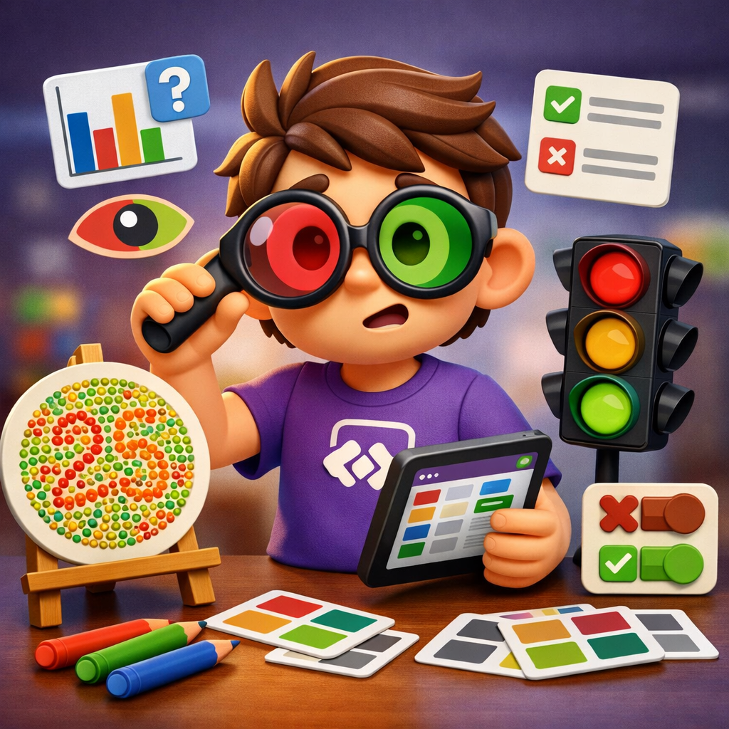
Color blindness.
It’s one of those accessibility topics that’s easy to underestimate. Especially in business apps.
👀 What color blindness actually means


When we talk about visual impairments, people often think about blindness or severe low vision. But color vision deficiency is far more common.
Most cases involve difficulty distinguishing:
- Red and green (most common)
- Blue and yellow (less common)
Now think about the average Power Apps solution.
- Green = Approved
- Red = Rejected
- Orange = Pending
- Red text = Error
- Green KPI = Good
- Red KPI = Bad
You see the pattern.
If color is the only thing communicating meaning, we’re excluding users without even realizing it.
And the tricky part?
You often won’t notice it yourself — because your brain fills in the gaps automatically.
The subtle exclusion in business apps
I review a lot of Power Apps. And I still regularly see:
- Status dots in a gallery that only differ by color
- Validation errors shown in red text without explanation
- Dashboards using red/green comparisons only
- Buttons that change state purely through color
To someone with red–green color blindness, those differences can look nearly identical.
That means:
- They might miss an approval state
- They might not see an error
- They might misinterpret a KPI
- They need more time to complete a task
And suddenly your “simple internal app” becomes frustrating.
Not because it’s complex.
But because it wasn’t designed inclusively.
The simple rule: never rely on color alone
This aligns directly with the Perceivable principle of accessible design.
If something communicates meaning through color, ask yourself:
If this were grayscale, would it still make sense?
If the answer is no — you have work to do.
Luckily, the fix is usually simple.
Practical improvements in Power Apps
1. Combine color with icons
Instead of:
- Green circle
- Red circle
Use:
- ✔ Approved
- ✖ Rejected
- ⏳ Pending
In Power Apps, this is straightforward with a Switch statement:
Icon =
Switch(
    Status,
    "Approved", Icon.Check,
    "Rejected", Icon.Cancel,
    "Pending", Icon.Clock
)
Now the icon carries meaning.
Color becomes supportive — not essential.
2. Don’t use red text as your only error indicator
A red border around a field is not enough.
Better:
- Red border
- Clear error message
- Proper AccessibleLabel for screen readers
Example:
AccessibleLabel =
If(
   IsBlank(TextInputName.Text),
   "Error. Name field is required.",
   "Name field."
)
Now you’re supporting:
- Users with color blindness
- Screen reader users
- People in bright sunlight
- People with tired eyes at 4 PM
Accessibility improvements rarely benefit just one group.
3. Be careful with dashboards
Red vs green charts are everywhere in reporting apps.
Instead:
- Use blue/orange combinations
- Add direct data labels
- Add icons for trends (▲ ▼)
- Provide a small data table underneath
Data should never depend purely on color differences.
4. Test in grayscale
This is one of my favorite quick checks.
Take your app.
Turn your screen to grayscale (or use a browser simulator).
Look at your dashboard.
You’ll instantly see what disappears.
It’s uncomfortable the first time.
But it’s a very effective reality check.
5. Respect contrast
Even for users without color blindness, low contrast is a problem.
Make sure:
- Body text meets at least 4.5:1 contrast ratio
- Buttons stand out clearly
- Focus states are visible
Power Apps supports high contrast themes — test your app with them enabled.
If it breaks visually, that’s valuable feedback.
Why this matters more than you think
Color blindness is often invisible.
Nobody announces it in a meeting.
Nobody files a complaint.
Most people simply adapt.
But adapting takes effort.
And unnecessary effort reduces usability.
When we remove that friction, we improve:
- Speed
- Accuracy
- Confidence
- Adoption
And that applies to internal apps just as much as public-facing platforms.
Inclusive design is not about adding complexity.
It’s about removing assumptions.
Quick checklist for your next Power App
Before publishing, check:
- Are status indicators supported by icons or text?
- Are error messages more than just red borders?
- Do charts still make sense without color?
- Is contrast sufficient?
- Did I test in grayscale?
If you fix just these things, your app is already significantly more inclusive.
A small mindset shift
I often say this in my sessions:
Accessibility isn’t about building something special for a small group.
It’s about designing in a way that doesn’t unintentionally exclude.
Color blindness is a perfect example of that.
It doesn’t require advanced tooling.
It doesn’t require massive redesigns.
It requires awareness.
And once you see it — you can’t unsee it.
If you’re building Power Apps this week, try one thing:
Open an existing app.
Look at every place where you use color to communicate meaning.
Add one additional indicator.
Start small.
Improve continuously.
That’s how inclusive applications are built.
 Pauliens Blog
Plaats een reactie